
How to Use Color Theory in Garden Design
Master color theory in garden design with practical guidance on the color wheel, complementary planting, monochromatic schemes, and seasonal color flow.
How to Use Color Theory in Garden Design
Color is the first thing most people notice about a garden. Before they see the shapes, the textures, or the clever spatial design, they see color -- the blaze of red dahlias, the cool drift of blue lavender, the gentle glow of evening primroses in late light. Color creates mood, guides attention, and gives a garden its emotional character.
Yet most gardeners choose color intuitively, buying whatever looks appealing at the nursery. Sometimes this works beautifully. More often, the result is a chaotic mix where individual plants are attractive but the overall composition lacks harmony. Color theory provides a framework for making deliberate choices that create specific effects, turning a collection of plants into a composed painting that evolves through the seasons. This guide makes color theory practical and accessible for garden design. For the full garden design process, see our beginner's guide to designing a garden from scratch.
The Color Wheel: Your Essential Tool
The color wheel arranges colors in a circle based on their relationships. Understanding three basic relationships gives you the tools to design any color scheme.
Primary Colors
Red, yellow, and blue. These cannot be mixed from other colors. They are bold, saturated, and dominant in the garden.
Secondary Colors
Orange (red + yellow), green (yellow + blue), violet (blue + red). Created by mixing two primaries. Slightly less assertive than primaries but still strong.
Tertiary Colors
The blends between adjacent primaries and secondaries: red-orange, yellow-orange, yellow-green, blue-green, blue-violet, red-violet. These nuanced hues are where most garden plants actually fall.
Warm and Cool
The wheel divides into warm colors (red, orange, yellow) and cool colors (blue, green, violet). This division is the most important concept for garden color design:
- Warm colors advance toward the viewer. They feel energetic, exciting, and intimate. They make spaces feel smaller and closer.
- Cool colors recede from the viewer. They feel calming, restful, and spacious. They make spaces feel larger and more distant.
This optical effect has powerful practical applications. Plant warm colors near the house or patio for vibrancy and excitement. Plant cool colors at the far end of the garden to increase the sense of depth and distance.
Understanding just one principle -- warm colors advance, cool colors recede -- will transform your garden color choices. A long, narrow garden that feels cramped can be made to feel twice as deep by planting hot colors near the house and cool blues and purples at the far end.
Four Color Schemes That Work
1. Complementary (High Contrast)
Complementary colors sit directly opposite each other on the wheel: purple and yellow, orange and blue, red and green. These combinations create maximum visual contrast and vibrancy.
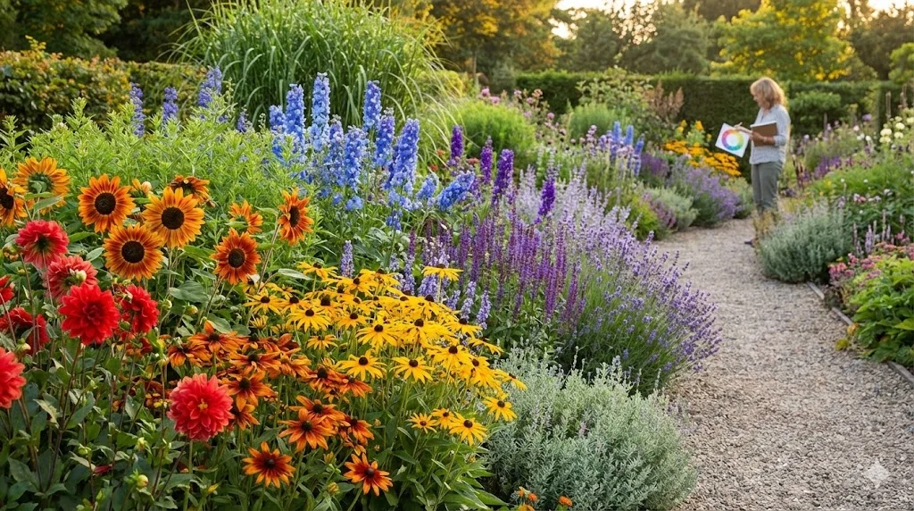
In the garden: Purple alliums rising through a carpet of golden creeping Jenny. Orange crocosmia against the blue of agapanthus. Red poppies against a green lawn.
When to use it: When you want a focal point that sings, a bed that demands attention, or a feature planting that creates a "wow" moment. Use complementary schemes for small areas or key moments within a larger, more subtle planting.
Caution: A large area planted entirely in complementary colors can feel aggressive and tiring. Use these combinations as accents within a broader scheme.
2. Analogous (Harmonious)
Analogous colors sit next to each other on the wheel: pink-purple-blue, yellow-orange-red, or green-yellow-lime. These combinations feel harmonious and unified because the colors share underlying pigments.
In the garden: A border of pink roses, purple salvias, and blue geraniums. A hot border of red dahlias, orange crocosmia, and yellow rudbeckia. A cool scheme of blue delphiniums, purple alliums, and mauve asters.
When to use it: For the main body of your planting. Analogous schemes are the easiest to get right and the most restful to look at. They create cohesive, flowing borders that feel composed rather than random.
3. Monochromatic (Sophisticated)
A monochromatic scheme uses variations of a single hue -- different tones, tints, and shades of the same color. The famous white garden at Sissinghurst is the most celebrated example.
In the garden: A white border with white roses, white foxgloves, white phlox, silver-leaved Artemisia, and white-variegated hostas. A blue border with delphiniums, agapanthus, salvias, cerinthe, and blue oat grass. A pink border ranging from palest blush through rose to deep magenta.
When to use it: When you want sophistication and restraint. Monochromatic schemes rely on texture, form, and tone variation for interest because there is no color contrast to do the work. They feel elegant and intentional.
Key: Vary the green foliage textures dramatically. In a monochromatic flower scheme, it is the foliage that provides the visual variety that keeps the composition interesting.
4. Triadic (Dynamic)
Triadic schemes use three colors equally spaced around the wheel: red, yellow, and blue; or orange, green, and violet. These create dynamic, balanced compositions with more variety than complementary schemes.
In the garden: Red roses, yellow achillea, and blue delphiniums. Orange lilies, green euphorbias, and purple verbena.
When to use it: In large borders where you want visual richness without the intensity of complementary pairs. Triadic schemes work well when one color dominates and the other two serve as accents.
The Crucial Role of Green
In a garden, green is not just a background -- it is the most prevalent color and the most important. The variety of greens available in foliage is astonishing:
- Lime green: Alchemilla mollis, Hakonechloa macra 'Aureola', Euphorbia amygdaloides var. robbiae
- Deep forest green: Yew, box, holly, camellia
- Blue-green: Hostas, rye grass, Festuca glauca, Eucalyptus
- Silver-green: Artemisia, lavender, Stachys byzantina, olive
- Bronze-green: Heuchera, Phormium, purple fennel, Cotinus
- Bright emerald: Ferns, fresh spring growth, Hakonechloa
A composition that uses only green -- a shade garden of ferns, hostas, box, and grasses -- can be as rich and satisfying as any flower border, provided the greens are varied in tone, texture, and form.
Green as a Separator
When two colors clash or the border feels too busy, green provides the visual rest that calms the composition. Inserting a green foliage plant between two conflicting colors is the simplest way to resolve a color problem.
Foliage vs. Flower Color
Most gardeners think of color as flower color. But flowers are fleeting -- a typical perennial blooms for two to six weeks. Foliage, on the other hand, is present for six to twelve months.
Designing with foliage color creates a scheme that looks good for the entire growing season, not just during peak bloom:
- Silver foliage (Artemisia, Stachys, lavender): Blends cool and warm schemes, reflects light, adds luminosity
- Purple foliage (Heuchera, Cotinus, Acer palmatum 'Atropurpureum'): Provides depth and contrast, makes adjacent greens appear fresher
- Golden foliage (Choisya 'Sundance', Spiraea 'Gold Flame', Hakonechloa 'Aureola'): Adds warmth and brightness, especially in shade
- Variegated foliage (Cornus alba 'Elegantissima', Hostas, Euonymus): Provides light in shade, creates rhythm through repetition
The most resilient color scheme is built on foliage contrast, with flowers layered on top for seasonal highlights. A border designed this way looks good from April to November, not just during the six weeks of peak bloom.
Seasonal Color Planning
Color in a garden is not static -- it changes throughout the year. The best gardens plan for a deliberate color narrative across the seasons.
Spring: Fresh and Light
Spring gardens feel best in fresh, light colors: primrose yellows, soft blues, blush pinks, white. The low-angle spring light makes these colors glow. This is the season for bulbs and early perennials.
Early Summer: Rich and Varied
Early summer brings the widest palette. Roses, peonies, delphiniums, geraniums, and foxgloves provide every color. This is the season to use your most ambitious color combinations.
Late Summer: Warm and Saturated
As summer matures, the palette shifts toward warmer, deeper tones: golds, ambers, oranges, deep reds, and purples. Dahlias, rudbeckias, echinaceas, and ornamental grasses dominate. The warm palette echoes the warmth of the light.
Autumn: Fire and Structure
Autumn color comes from foliage, berries, and late flowers. Japanese maples, cotoneaster berries, aster purples, and the tawny gold of dying grasses create a palette that is mellow, rich, and contemplative.
Winter: Subtle and Structural
Winter color is rare and therefore precious. The red stems of Cornus, the yellow flowers of mahonia and winter jasmine, the white of snowdrops, and the dark green of evergreens. In winter, structure and form matter more than color.
Applying Color Theory to Your Garden
Step 1: Choose a Core Palette
Select two or three main colors for your garden. Keep it simple. A garden with ten different color themes feels chaotic.
Step 2: Assign Colors to Zones
Use warm colors near the house and in intimate areas. Use cool colors in the distance and in areas intended for relaxation. This creates a natural spatial flow.
Step 3: Repeat Key Colors
Repetition creates rhythm and cohesion. Carry your core colors throughout the garden, appearing and reappearing in different beds. This ties the garden together as a unified composition.
Step 4: Use Accents Sparingly
A single contrasting color used in small amounts creates drama and focal points. A dash of red in a predominantly blue-purple border. A burst of orange in a green-and-white garden. Restraint is key -- accents lose their power if overused.
You can test color combinations in your garden design before purchasing plants, helping you visualize how different palettes will look in your specific space and light conditions.
Common Color Mistakes
- Too many colors: A border with every color in the rainbow feels chaotic. Edit ruthlessly.
- Ignoring foliage: Planning only flower color produces a scheme that looks good for a few weeks and flat for the rest of the year.
- Equal amounts of every color: One color should dominate (60-70%), with secondary colors at 20-30% and accents at 5-10%.
- Forgetting about white: White (and near-white: cream, ivory, palest pink) is a powerful tool. It lights up shade, separates clashing colors, and adds freshness to any combination.
- Not testing in situ: Colors look different in garden center lighting than in your garden's actual light conditions. Buy one plant, place it in position, and evaluate before buying twenty.
Getting Started with Color
Choose one bed in your garden and apply a single color scheme to it -- analogous is the easiest to start with. Select five to seven plants in three related colors plus green, arrange them by height and texture, and plant in groups of three or five. Step back and observe how the colors interact.
Garden Design Team
Expert garden designers sharing tips, inspiration, and practical advice for creating beautiful outdoor spaces.
Explore professional garden design
Scapiera is a paid professional garden-design application. See plans for included capabilities and availability.
Join the waitlistRelated articles
Backyard Garden Design: Creating Your Outdoor Sanctuary
Design a backyard that works as an outdoor living space. Zoning for dining, relaxation, and play, with privacy screening and year-round planting.
Balcony Garden Design: Growing in Containers
Create a thriving balcony garden with smart container choices, wind-resistant plants, vertical systems, and self-watering solutions for high-rise growing.
Corner Lot Garden Design: Two-Sided Curb Appeal
Design a corner lot garden that impresses from both streets. Dual frontage planting, visibility sightlines, wraparound beds, and privacy from two directions.